While images make up the majority of most sites’ page weight, the HTML and CSS that call and implement these images also impact total page load time. The way that you structure and name your markup can help you keep your site maintainable and high performing; intentional organization of your CSS and design patterns will allow you to focus on repurposability and the meaning behind your site’s look and feel. Keeping both your HTML and CSS clean and meaningful will result in a faster-loading site and a better overall user experience. In this chapter, we will cover best practices for loading HTML, CSS, fonts, and JavaScript on your site.
Cleaning Your HTML
Clean HTML is the foundation for a high-performing site. Though older sites tend to suffer from multiple designers or developers editing and adding to markup, even newer sites can benefit from a clean sweep—looking for embedded or inline styles, unused or unnecessary elements, and poorly named classes and IDs.
In Chapter 1, I mentioned that I was able to cut page load time in half for one site by simply cleaning up its markup and styles. I focused on killing bloated HTML and CSS, which resulted in smaller HTML, CSS, and stylesheet image file sizes.
When looking at your site’s HTML, watch for:
- Embedded or inline styles that should be moved to a stylesheet
- Elements that have no need for special styling (unnecessary HTML elements, also known as “divitis” and covered in the next section)
- Old, commented-out code that can be removed
If a site has been edited by multiple developers or designers, there may be markup that seems unused or unnecessary. As sites age, outdated techniques, like using tables for layout, tend to live on without being cleaned or updated to newer best practices. Be ruthless when eliminating any superfluous or outdated HTML. There’s rarely a good “just in case” reason for keeping unnecessary or convoluted markup; it’s often better to kill it and know that, if you really need to, you can reference it in the future using version control.
Divitis
“Divitis” happens when you have lots of elements in your HTML that serve little purpose other than to help you style content. Often divitis happens when lots of div elements take the place of more meaningful, semantic HTML elements, but the mess can happen with any kind of HTML element:
<div>
  <div>
    <header>
      <div id="header">
        <h1><span>Site Name</span></h1>
      </div>
    </header>
  </div>
</div>
It’s unclear why we have so many elements in the preceding example; maybe there’s something fancy that happens with styling within the span; maybe those other divs are meaningful to the structure of the page. But this is definitely a sign that something is wrong and should be inspected with your markup. Usually divitis is an indicator that the code author was overwhelmed with the cascading nature of styles and wanted to try to override the look and feel of an element, and did so by adding extra parent elements to target with CSS.
Divitis should be eradicated in your markup. It adds bloat to both your HTML and your CSS, and by removing unnecessary elements you’ll create a much more meaningful and straightforward hierarchy for your site. If possible, use HTML5 elements (such as header and article) to create a semantic hierarchy. It will be easier to see how you should write your CSS, and will illuminate opportunities for repurposable design patterns.
To eliminate divitis, take a look at the styles applied to the elements in the bloated area. See if it’s possible to combine style declarations and apply them to the correct, semantic HTML elements to result in a better HTML hierarchy, such as:
<header>
  <h1>Site Name</h1>
</header>
Or simply:
<h1>Site Name</h1>
Sometimes, you’ll need to retain some elements for layout and semantic structure, such as the header element in this example. But more often than not, inspecting and reducing the number of elements on your page will surprise you; thanks to the power of HTML5 and CSS, you’ll be able to accomplish a lot with a solid, lightweight HTML hierarchy.
Semantics
Semantic element names are those that represent the kind of content within the element. Good semantic element choices include representative HTML5 elements like header or nav, or class and ID names like login or breadcrumbs. Avoid nonsemantic names, like left or blue, which describe the look and feel of content to the user rather than the content’s meaning.
Renaming elements to be more semantic will help you create better HTML structure for your page, and will also allow you to create design patterns for reuse across the site. For example, here’s a nonsemantic HTML structure with a little bit of divitis thrown in:
<div class="right">
  <div id="form">
    <form>
      <p class="heading">Login</p>
      <p>
        <label for="username">Username:</label>
        <input type="text" id="username" />
      </p>
      <p>
        <label for="password">Password:</label>
        <input type="text" id="password" />
      </p>
      <input type="submit" value="Submit" />
    </form>
  </div>
</div>
Our styles for this sidebar and login form:
form {
  background: #ccc;
}

.right {
  float: right;
  width: 200px;
}

#form form {
  border: 1px #ccc solid;
  background: yellow;
  padding: 10px;
}

.heading {
  font-weight: bold;
  font-size: 20px;
}
In this example, there’s nothing particularly meaningful about the way that these elements are currently named; it’d be very easy to override the styles for .right elsewhere in a stylesheet and not realize that it affects other elements that are using this class name.
Also, it’s not clear which of these styles are design patterns that could be repurposed throughout the site. In this CSS, we set a background for #form, and then override this background color later in our CSS for this particular login form. It’s likely that we want this particular login form to stand out. Renaming and restructuring it to be more semantic will result in a much more understandable CSS file and potential design pattern:
<div class="sidebar">
  <form id="login">
    <h2>Login</h2>
    <ul>
      <li>
        <label for="username">Username:</label>
        <input type="text" id="username" />
      </li>
      <li>
        <label for="password">Password:</label>
        <input type="text" id="password" />
      </li>
      <li>
        <input type="submit" value="Submit" />
      </li>
    </ul>
  </form>
</div>
We replaced the existing nonsemantic structure with a significantly more semantic structure and naming convention. We now have a sidebar, a clear and unique name for our form, and an unordered list to group the form elements together. While it results in slightly more CSS, this is actually a good thing for the overall cleanliness of our code:
form {
  background: #ccc;
}

form ul {
  list-style-type: none;
  padding: 0;
}

h2 {
  font-weight: bold;
  font-size: 20px;
}

.sidebar {
  float: right;
  width: 200px;
}

#login {
  border: 1px #ccc solid;
  background: yellow;
  padding: 10px;
}
As you can see, it’s going to be easy to keep all unordered lists within standard forms on our site styled the same way. Similarly, a header (in this case an h2) within our login form should have the same styling as other sibling headers within our page. Our .sidebar styles are much less likely to be overridden by future edits to our stylesheet, and #login can retain its very unique styling. Though this adds a few more lines of CSS to our example, it will also likely result in a cleanup of the rest of our CSS file, as we could eliminate other styles that override the styling of forms and paragraphs made to look like headers.
Semantic naming allows you to maintain your HTML and CSS as it ages, as it is easier to read, test, and edit over time. Cleaner HTML and CSS typically create smaller files, which improve page load time, and also reduce the risk of page weight bloat as a site ages. Because they are more meaningful, semantic structures allow for more repurposability of designs and styles, which in turn creates a better end user experience.
Accessibility
In addition to the editability and performance of semantic markup, clean HTML benefits users with accessibility needs. Semantic HTML makes the hierarchy of content meaningful for browsers, search engines, and screen readers. With new HTML5 tags like post and aside, and through the implementation of existing semantic structures like headings, paragraphs, and lists, content on the Web can become more accessible to everyone. Search engine bots and screen readers for the visually impaired are primarily looking at the HTML content of your page, rather than how it displays in a browser with CSS styles applied and JavaScript animations and interactivity running. The cleaner and more semantic your HTML is, the better the experience is for these users.
The Web Content Accessibility Guidelines (WCAG) provide more information on how to make your website accessible to people with disabilities. If you are using a clean and semantic HTML hierarchy, you are well on your way to making your site accessible. The World Wide Web Consortium (W3C) provides a full WCAG 2.0 checklist to help you understand and meet all of the current WCAG requirements.
Frameworks and Grids
There are plenty of helpful frameworks and grids on the Web that aid designers and developers who are looking to start a website but don’t want to start from scratch. Bootstrap, HTML5 Boilerplate, and 960 Grid are examples of foundation CSS, HTML, and JavaScript that can help you kick-start a site design.
However, grids and frameworks come at a cost. Because they are designed to cover a large number of generic use cases, they will include plenty of things that you don’t need on your site. This extraneous content can be a hindrance to your page load time rather than an aid to your development time; if you’re not careful about how much is included as you start implementing a grid or framework, you could have a lot of unnecessary assets, markup, or styles loaded on your site.
Here are some styles included in the HTML5 Boilerplate framework. They’d be helpful styles for sites that include dfn, hr, or mark elements, but these lines could be eliminated on sites that don’t use these elements:
/**
 * Address styling not present in Safari 5 and Chrome.
 */

dfn {
    font-style: italic;
}

/**
 * Address differences between Firefox and other browsers.
 * Known issue: no IE 6/7 normalization.
 */

hr {
    -moz-box-sizing: content-box;
    box-sizing: content-box;
    height: 0;
}

/**
 * Address styling not present in IE 6/7/8/9.
 */

mark {
    background: #ff0; color: #000;
}
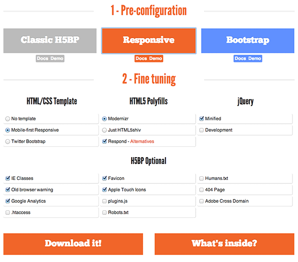
If you really want to use a framework, be sure to clean out all of the extraneous material before your end user tries to load your site. Remember that grids and frameworks are likely not providing the semantic structure that we’re aiming for, as they are generic and one-size-fits-all. Some, like HTML5 Boilerplate, give you custom build options that you should take advantage of, as shown in Figure 4-1.
As much as possible, clean up the naming and element structure of your pages after implementing an out-of-the-box framework or grid. There’s no excuse for forcing your end users to load unnecessary styles, markup, or JavaScript.
Cleaning Your CSS
A thoughtful HTML hierarchy and deliberate choices about your site’s layout and design will set you up for clean, easily editable, and performant CSS. As you examine your site’s existing CSS to look for ways to clean it up, think about how it reflects your HTML hierarchy and design choices. Maybe you’ll see:
- Element names that don’t have semantic meaning
!importantdeclarations- Browser-specific hacks
- Lots of selector specificity
Look for unused elements, styles that could be combined or rewritten for efficiency, and outdated ways of handling browser inconsistencies. As sites age, we need to routinely examine our CSS and consider implementing new technology and techniques to improve page load time. The more deliberate we can be with our site hierarchy and the purpose behind our design choices, the cleaner our CSS will be. Code maintainability and site performance go hand in hand.
Unused Styles
If you have an existing site, the first CSS cleanup task to tackle is removing unused styles. As sites age, unused styles will crop up unnoticed, adding bloat to your stylesheets. Unused styles may be left over from deleted elements or entire pages on your site, elements that have been renamed or redesigned, or overrides from third-party widgets that you no longer use. There is no reason to keep unused selectors or styles in your stylesheets and force your end user to download them; your version control will come in handy should you ever need to look back in history to view old CSS.
There are a number of tools currently available to you for finding potential CSS to eliminate. Dust-Me Selectors is a browser plug-in for Firefox and Opera that can scan your website’s HTML to find unused selectors. In Chrome DevTools, there is an Audits tab (Figure 4-2) that will allow you to run a Web Page Performance audit and see a list of unused CSS rules.
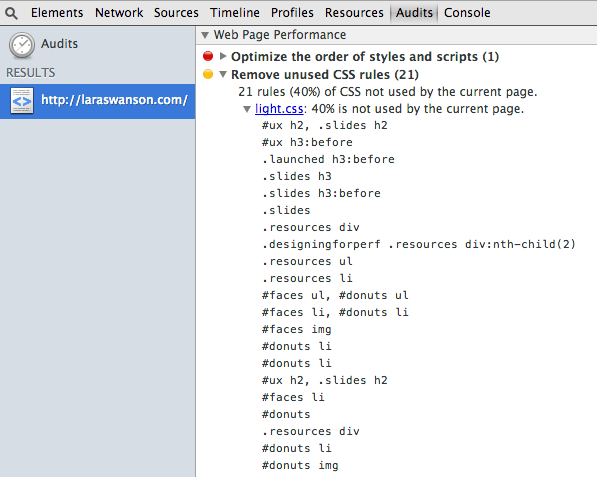
Be wary of the outputs of these tools; Dust-Me Selectors may not have crawled every page of your site, and Chrome DevTools is looking only at the CSS selectors on the current page (not any additional pages where the same stylesheet is called). These tools are excellent for helping you get an initial list of selectors to examine in your stylesheets and then begin to test removing them.
Combine and Condense Styles
Duplicate styles for unique elements across your site are a great indicator of consistent styling and thoughtful design. Look through your stylesheets for opportunities to combine or condense these styles, as they will help with both the performance and maintainability of your code. Here we have two elements that share similar styles:
.recipe {
  background: #f5f5f5;
  border-top: 1px #ccc solid;
  padding: 10px;
  margin: 10px 0 0;
  font-size: 14px;
}

.comment {
  background: #f5f5f5;
  border-top: 1px #ccc solid;
  padding: 10px;
  margin: 9px 0 0;
  font-size: 13px;
}
The only differences between the way these two elements are styled are that .comment has a different font-size declaration and margin declaration. We can combine these styles into one main declaration block and then style .comment’s differences separately:
.recipe, .comment {
  background: #f5f5f5;
  border-top: 1px #ccc solid;
  padding: 10px;
  margin: 10px 0 0;
  font-size: 14px;
}

.comment {
  margin: 9px 0 0;
  font-size: 13px;
}
Or, ask yourself: is there a reason why .comment has a slightly different font size and margin below it? What if you combined the styles in .recipe and .comment to create a true pattern? The complexity would be reduced and ease of maintenance would increase, and better yet, our CSS file will be shorter!
.recipe, .comment {
  background: #f5f5f5;
  border-top: 1px #ccc solid;
  padding: 10px;
  margin: 10px 0 0;
  font-size: 13px;
}
If you find that this pattern will be repeated often, you could also generalize the class name so it can be used throughout the site, rather than continuing to add class names to this comma-separated list.
Slight differences between elements that share a lot of styles could be due to many things: pixel-perfect web versions of PSD mockups, accidental updates to one place where a style existed but not another, and more. Throughout your stylesheets you may see many different pixel-specific heights, widths, margins, and padding defined. Are they intentionally slightly different from one another, or could they be normalized?
Look for these kinds of opportunities to normalize and create patterns. Presumably these elements share the same look and feel intentionally; as one element’s design changes in the future, you’ll probably want the other one to change in the same way. Combining them to define their shared styles will help save you development time in the future, and the shorter CSS file will help you with page load time now.
Additionally, you could begin to define rules for spacing and font sizes that are easy to follow. One great way to make these decisions easier is to look at your base font-size and use it to inform the rest of your design decisions. If your main content is a 14 px font with a line-height of 1.4 em, you could do a little math to create:
- Header font sizes in multiples of 14 px
- Margins and padding in multiples of 1.4 em
- A custom grid based on 14 px or 1.4 em increments
CSS also allows you to leverage the power of shorthand style declarations. Shorthand declarations, such as background, include many individual style values in one line. The background declaration, for example, includes:
background-clipbackground-colorbackground-imagebackground-originbackground-positionbackground-repeatbackground-sizebackground-attachment
You may set one, some, or all of these values when using background. Leveraging shorthand declarations like this allows you to further combine and condense styles in your CSS. For example, let’s say we have three similarly styled elements with slightly different borders and padding:
.recipe {
  background: #f5f5f5;
  margin: 10px 0 0;
  border: 1px #ccc solid;
  padding: 10px 0;
}

.comment {
  background: #f5f5f5;
  margin: 10px 0 0;
  border: 1px #fff solid;
  padding: 10px 0 0;
}

aside {
  background: #f5f5f5;
  margin: 10px 0 0;
  border: 2px #ccc solid;
  padding: 10px 0;
}
We can set the shorthand property for the styles that are common between the elements, and later style the small differences using individual (longhand) properties:
.recipe, .comment, aside {
  background: #f5f5f5;
  margin: 10px 0 0;
  border: 1px #ccc solid;
  padding: 10px 0;
}

.comment {
  border-color: #fff;
  padding-bottom: 0;
}

aside {
  border-width: 2px;
}
This allows us to write easily readable CSS. If we had redefined the shorthand border declaration again for .comment, it would have been harder to figure out which part of the border was different from our original style declaration. By using the longhand property, we can easily spot what part of the style we are changing. Shorthand properties can reduce the amount of lines in our CSS, which is good for performance.
Sometimes, renaming elements can help you combine and condense styles. Take a look at these similarly styled elements:
h3 {
  color: #000;
  font-weight: bold;
  font-size: 1.4em;
  margin-bottom: 0.7em;
}

#subtitle {
  color: red;
  font-weight: bold;
  font-size: 1.4em;
  margin-bottom: 0.7em;
}

.note {
  color: #333;
  font-weight: bold;
  font-size: 1.4em;
  margin-bottom: 0.7em;
}<h1>My page title</h1>
<article>
<h2>My article title</h2>
<div id="subtitle">My article’s subtitle</div>
<p>...</p>
</article>
<aside>
<div class="note">I have a side note</div>
<p>...</p>
</aside>
<footer>
<h3>My footer also has a title</h3>
</footer>
In a case like this, it may be possible to rename elements to create a more semantic hierarchy as well as cleaner CSS. Use your best judgment. In this case, we’ll decide that in fact #subtitle, .note, and h3 are all semantically third-level headers in our page and rename them in our HTML:
<h1>My page title</h1>

<article>
  <h2>My article title</h2>
  <h3>My article’s subtitle</h3>
  <p>...</p>
</article>

<aside>
  <h3>I have a side note</h3>
  <p>...</p>
</aside>

<footer>
  <h3>My footer also has a title</h3>
</footer>
By renaming them in our HTML, we’ve automatically combined the original styles in our CSS, as they now all fall under the h3 style block. We can add specificity to change the colors of the article and aside headers below this block:
h3 {
  color: #000;
  font-weight: bold;
  font-size: 1.4em;
  margin-bottom: 0.7em;
}

article h3 {
  color: red;
}

aside h3 {
  color: #333;
}
Lastly, if you use a CSS preprocessor like LESS or SASS, you may still end up with a bloated CSS file with lots of opportunity for repurposing or condensing styles. Good planning and purposeful, reusable design patterns will help you develop CSS using a preprocessor, just like when you’re writing regular CSS. Focus on keeping any mixins (reusable style blocks that are defined once) as efficient as possible, and be sure to watch the output of your stylesheets over time. Bloated files can sneak up on you, and it’s good to routinely and continually check on your CSS efficiency.
Clean Stylesheet Images
Once you’ve combined and condensed styles, take a look at any images called from your stylesheet. Remember, images make up the majority of most sites’ page weight, so reducing the size and number of stylesheet image requests will be a huge boost to your site’s page load time.
First, look for opportunities to create sprites. If you have many icons or other small images used throughout the site, a sprite can be a huge help in optimizing requests. Read “Sprites” for more information on how sprites boost performance, and how to implement them.
Second, as sites age, so do their sprites. You may notice that existing sprites include outdated or no-longer-used images. Examine your existing sprites: are there any sections that can be removed? Can you clean up the CSS that uses these sections? Can you clean up and then re-export the sprite image in a more appropriate file type or with higher compression? The cleaner your sprites are, the better your page load time will be.
Next, look for opportunities to replace your stylesheet images with CSS3 gradients, data URIs, or SVG. You can read more about creating gradients in “CSS3,” and more about how to create high-performing SVG replacements in “SVG.” CSS3 gradients are an excellent replacement for any repeating background images that are currently implemented with CSS; they are also very easily editable and repurposable throughout stylesheets. Replacing images with CSS3 may very quickly speed up your site. Similarly, replacing stylesheet images with SVG can improve your page load time, as an SVG file can replace both retina and nonretina images in your stylesheet.
Ensure that any new icons or other images added to your stylesheet have meaning or purpose in your site design. Document these in a style guide so that other developers or designers can see what icons have already been added to the site and how they are currently used. Often, stylesheet image creep occurs because it’s unclear what images are already available for use across a site. I’ve seen many sites develop multiple ways to indicate warnings or alerts with various icons and highlighting, rather than stick with a single styling convention. As you examine your stylesheet to find opportunities for design patterns, consider the number of stylesheet images called and whether they can be condensed.
Remove Specificity
When it comes to CSS, specificity is the term for how you write out selectors to help a browser determine which CSS rules are applied. There are different kinds of selectors, and each carries its own weight; specificity is calculated by a formula based on these selectors. If two selectors apply to the same element, the one with higher specificity wins.
You’ll often see overly specific selectors in a CSS file. This usually occurs when a designer or developer was trying to add weight to override previously defined styles that apply to a certain selector. For example:
div#header #main ul li a.toggle { ... }
Why did this stylesheet author choose to add all of these selectors in a row? Why wasn’t it possible to simply style:
.toggle { ... }
It’s possible that the author really needed all of that specificity in order to set a style correctly. However, this much specificity is also an indicator that something in the stylesheet or HTML hierarchy could be much more efficient. Inefficient selectors tend to happen because of CSS overriding previous overly specific CSS, and this is a good thing to watch for so you can find areas to clean up and make more efficient. This happens frequently in larger organizations where there are many people touching the same piece of code.
Inefficient selectors used to be considered inherently bad for performance, but that’s less of a concern these days with high-performing modern browsers. However, it’s still smart to clean up selectors, as they can help you maintain your frontend architecture.
The more efficient your CSS is, the better performing it will be. Reducing specificity means that it will be easier to override styles with the naturally cascading power of CSS, rather than slip in additional weight or !important rules. Inefficient selectors and !important rules tend to add bloat to CSS files. Always start with the smallest, lightest selector possible and add specificity from there.
Optimizing Web Fonts
Web fonts add more requests and page weight to your site. Fonts are the classic example of weighing aesthetics and page speed; it’s important to focus on making fonts as efficient as possible, loading them deliberately, and measuring their impact on both performance and engagement metrics to make sure they’re worth including.
Loading a web font looks like this:
@font-face {
  font-family: 'FontName';
    /* IE9 Compatability Mode */
    src: url('fontname.eot');
    /* IE6-IE8 */
    src: url('fontname.eot?#iefix') format('embedded-opentype'),
    /* Modern Browsers */
    url('fontname.woff') format('woff'),
    /* Safari, Android, iOS */
    url('fontname.ttf') format('truetype');
}
Support for the Web Open Font Format, or WOFF, is increasing, so depending upon your user base and which browsers your site supports, you may be able to move to a shorter @font-face declaration, which would support Chrome 6+, Firefox 3.6+, IE 9+, and Safari 5.1+:
@font-face {
  font-family: 'FontName';
  src: url('fontname.woff') format('woff');
}
You’ll then apply this font to a selector using font-family, and include
fallback fonts just in case your new font hasn’t loaded for your user:
body {
  font-family: 'FontName', Fallback, sans-serif;
}
Web font files come in a range of sizes, from just a few kilobytes to upward of 200 kilobytes. Inspect your web font files to see how large they are and look for the following opportunities to cut their weight:
- Do you need only a few characters rather than the entire alphabet and all punctuation, such as when you’re applying a font just to a logo?
- Does the font support multiple languages? Is it possible to reduce language support to just one subset (such as a Latin subset)?
- Can you eliminate any unnecessary individual characters?
Character subsetting is a powerful tool for reducing your web font file size. If you’re using a font from a hosted font service such as Google, you may be able to choose to load only a certain character subset. In this example, we would load Google’s Philosopher font with a Cyrillic subset:
<link href="https://fonts.googleapis.com/css?family=Philosopher
  &subset=cyrillic" rel="stylesheet" />
If you want to load only certain characters from a Google hosted font, you can specify those as well. For example, we can load the Philosopher font with only the characters H, o, w, d, and y:
<link href="https://fonts.googleapis.com/css?family=Philosopher
  &text=Howdy" rel="stylesheet" />
Externally hosted fonts like those from Google have a better chance of already being cached for your visitors, but if they’re not cached for a particular visitor, then they’ll require an extra lookup and request from the external domain to be fetched. Self-hosted fonts save that extra DNS lookup but will not be already cached the first time a visitor comes to your site.
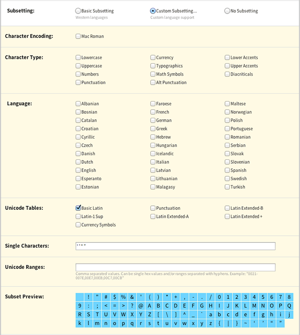
One additional benefit of hosting the font yourself is customization of the font file. If you are hosting your own web font, you can run it through a tool like Font Squirrel’s Webfont Generator and choose a custom character subset to optimize the font file, as shown in Figure 4-3.
You may also want to use multiple font weights for your web font. Be deliberate about how many font weights you load; as you apply more font files, the page will get heavier and will require more requests, which has a hugely negative impact on performance. Use as few alternative weights as possible, and be sure to weigh the balance between aesthetics and performance with fonts (read more about this choice and how to measure it in Chapter 7).
An additional optimization you can make to your web font loading technique is to load fonts only on large screens. This will eliminate the requests and extra page weight on smaller devices like smartphones, which tend to take larger performance hits (read more about why in “Mobile Networks”). Use a media query to apply the web font:
@media (min-width: 1000px) {
  body {
    font-family: 'FontName', Fallback, sans-serif;
  }
}
The most important action you can take when applying web fonts is to be deliberate about their uses. Document when and how to use a particular font weight so that others working on your site can repurpose this markup and understand when it is appropriate to apply a font weight. Make it clear that a particular display weight should be used only for a certain kind of header, or that you reserve a text weight for special design patterns. This will help educate other designers and developers working on your site, and hopefully will help keep your site as fast as possible. Read more about the performance benefits of creating style guides in “Style Guides.”
Creating Repurposable Markup
Creating design patterns using repurposable markup is the key to maintaining performance as your site’s design evolves. As you make decisions about the meaning of your site’s hierarchy, layout, and feel, you have the opportunity to be deliberate about loading assets and creating opportunities for markup reuse across the site. Design patterns save both development time and page load time. Markup reuse will:
- Provide an opportunity for asset caching
- Prevent designers or developers from reinventing the wheel
- Eliminate unnecessary asset requests as new content is added
- Help you isolate styles and assets that are no longer necessary
By normalizing the colors used across the site, documenting reusable patterns like spinners and sprites, and defining when and how to implement assets like fonts, you can equip your team to make smart decisions about page load time as your site evolves.
Let’s take normalizing colors as an example. Examine your site’s CSS file and find all of the color values used. How many different shades of gray are implemented? When you show warning indicators in your user interface, do they use a consistent set of colors, or are there multiple shades of red or yellow? How about your main site colors: do you have a single hexadecimal value that is repeated throughout the site, or are there variations of lightness and saturation around a theme?
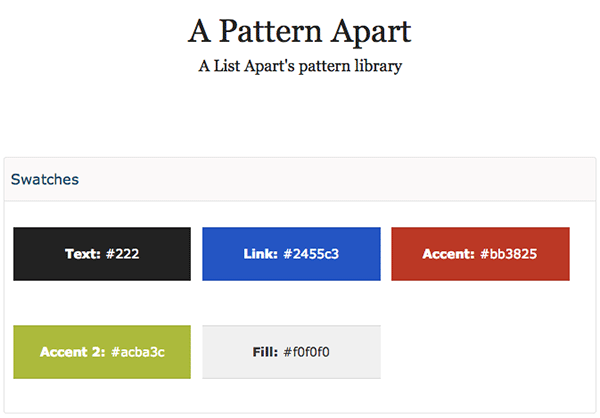
The more variation you have in colors throughout your design, the less meaningful those colors will be and the messier your stylesheet can become. Collect them all in one place and see which can be condensed. As you narrow down your color choices, start to determine why these colors may be used. For example, a List Apart’s pattern library includes a description of when to use certain colors (Figure 4-4).
When I worked on a site with lots of golden yellows and deep grays, I cleaned up the stylesheet to make the site’s colors more consistent. I documented which hexadecimal code to use when a designer wanted to use a bold yellow, a light yellow, a red warning message, a green “changed” message, and so on. I also went through and cleaned up all gray usage, determining which values should be used and when (such as #aaa for disabled text and borders, #eee for backgrounds, etc.). After documenting the colors and their meaning, I went through and replaced existing colors with the new, normalized values. This allowed me to combine and condense many styles, since there were now repurposable patterns. These efforts decreased the main stylesheet file by 6%, saving not just future development and maintenance efforts, but also page load time.
Style Guides
Creating repurposable design patterns is excellent, and the key to their continued reuse is documentation. Style guides can be great resources for many audiences: editors, developers, designers, and anyone else who may look for guidance on your site’s design and development best practices.
Style guides showcase the best way to implement code and request assets, allowing you to make sure other people who work on your site also are helping to make it as high performing as possible. Putting your site logo assets in one place and optimizing the files to be as small as possible and in the best format for the job will help ensure that future logo implementations also follow best practices. Documenting your site’s standardized and optimized loading indicator will make it easy for a future designer to implement this pattern and not reinvent the wheel with a new, slow, heavy spinner. Putting effort into your style guide now will help ensure that your site remains as fast as possible in the future.
Consider including the following information in your style guide:
- Hexadecimal color values and when they should be used
- Button classes and how they should be used
- Sprites and what classes correspond to which icons within them
- Typography, including how headers should be styled and how to import and apply any web fonts
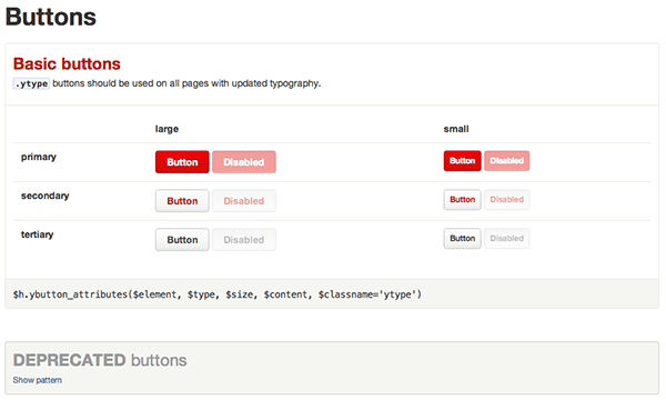
As you document best practices, include notes on how to implement these styles. Add example HTML or CSS markup, how to include the right JavaScript file, or any other notes on efficient implementation. For example, Yelp’s style guide includes a section on buttons that showcases the right way to style primary, secondary, and tertiary buttons, as well as a section on deprecated button styles that should no longer be used (Figure 4-5).
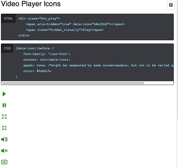
Make any markup easy to copy and paste so that the barrier to excellent implementation is low for future designers and developers. For example, the Starbucks style guide includes a how-to on implementing the company’s icon font, with example HTML and CSS as well as embedded examples of each icon (Figure 4-6). It should be as easy and intuitive as possible to repurpose the patterns and reuse the assets in your style guide.
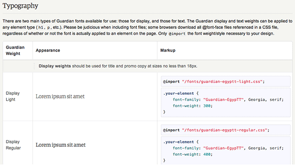
A combination of easy-to-understand use cases, markup that can be copied and pasted easily, and beautiful examples will make it easy for other people working on your site to implement these patterns. Be thorough in your documentation while keeping it intuitive. For example, when documenting web font usage, outline the potential font weights you could include, how to implement each efficiently, and rules about when they should be used, like we did in Etsy’s style guide (Figure 4-7).
Repurposable patterns save page load time as well as design and development time. As your site’s design changes in the future, it will be even easier to update all the instances of a particular pattern, because they will share the same assets and styles. The more patterns are repurposed, the higher the chances are that the styles and other assets will already be cached, the shorter your stylesheets will be, and the faster the site will load.
Additional Markup Considerations
After you’ve cleaned up your markup and styles, there are additional optimizations you can make to your assets’ load order, minification, and caching to improve page load time. Deliberately loading assets and understanding how they are delivered to your user will help you improve your site’s overall user experience.
CSS and JavaScript Loading
There are two main rules when it comes to loading CSS and JavaScript:
- Load CSS from the
<head>. - Load JavaScript at the bottom of the page.
Now that you’ve read about the critical rendering path in “Critical Rendering Path,” you know that CSS blocks rendering. If stylesheets are included near the bottom of the page, they will prohibit the page from displaying its content as soon as possible. Browsers want to avoid having to redraw elements of the page if their styles are changing; putting your stylesheets in the <head> allows content to be displayed progressively to the user because the browser isn’t still looking for more style information.
Reducing your stylesheets to as few files as possible will help reduce the total number of requests your site makes, and will result in a much faster page load time. This also means you should avoid using @import, which can significantly increase page load time. Smaller CSS is always better; I recommend aiming for 30 KB or less of CSS and a single stylesheet wherever possible. For larger sites, it can be better to have one sitewide stylesheet and then page-specific stylesheets as needed. This way, the sitewide stylesheet is cached and the user will need to download only a little bit of additional CSS for each page with additional styles.
JavaScript files should be loaded at the end of the page and loaded asynchronously whenever possible. This will allow other page content to be displayed to the user more quickly, as JavaScript blocks DOM construction unless it is explicitly declared as asynchronous.
When a browser’s HTML parser finds a script tag, it knows that the tasks in this script might alter the page’s render tree, so the browser pauses its DOM construction to let the script finish what it wants to do. Once it’s done, the browser will resume DOM construction from where the HTML parser left off. Moving script calls to the end of the page and making them asynchronous helps with perceived performance by optimizing your critical rendering path and eliminating those render-blocking issues.
If you make a call to a JavaScript file rather than inlining the script within your HTML, your user’s browser needs to go request that file from your server (or a third party’s server, if it’s a resource you’re calling from another site). This could add tens to thousands of milliseconds of wait time before the HTML parser can continue rendering the DOM. However, you can indicate to the browser that this script doesn’t need to be executed right away, and therefore shouldn’t block content rendering, by adding the async tag to your script:
<script src="main.js" async></script>
This allows the browser to continue to construct the DOM and will execute the script once it’s downloaded and ready.
When it comes to asynchronous scripts, there are some “gotchas” to look out for. As you implement asynchronous scripts that load new content, be sure to watch out for how this affects the user experience.
Anything that loads late and affects page layout can cause content to shift, surprising the user; build in placeholders to make sure the page looks and feels stable as it loads.
Note that the asynchronous attribute load order is not guaranteed, which can cause dependency problems. Depending upon the content, you may also consider building in a loading indicator while content is being called asynchronously so that your users understand there are pieces of information missing. Also note that asynchronously loaded content may not play nicely with bookmarks, back buttons, and search engines; keep this in mind as you optimize the critical rendering path and the user experience.
Third-party content like ads, social sharing buttons, and other widgets can be a performance hit on any site. You should already be loading these asynchronously, and ensure that these externally hosted resources are not a single point of failure for your site. Third-party scripts can add a lot of overhead in terms of page weight, but they’re also a performance problem because they require an additional DNS lookup and connection since they live off your site. You also won’t have control over caching for third-party resources.
Try to eliminate as many third-party scripts as possible. The fewer requests you have, the better your page performance can be. Attempt to combine and condense scripts; you can often do so by replicating, optimizing, and then hosting a third party’s script on your own site. Try to replace social sharing scripts with simple links. Routinely assess the value of having a third-party resource called on your page: does the performance hit outweigh the benefit of whatever that resource provides to your users?
In terms of script performance, watch your waterfall charts to make sure that your JavaScript files are loading after your other content and not blocking other downloads or rendering important pieces of the page. Scripts that load ads, social sharing, and other auxiliary content should definitely not block the loading or rendering of other content on the page.
Minification and gzip
See all the whitespace, unnecessary semicolons, and leading zeros in your stylesheets? How about all of those unneeded spaces, newlines, and tabs in your JavaScript files? It’s time to minify these assets by removing unnecessary characters from the code before they are seen by your end user. Minification results in smaller file sizes, which is great for improving the performance of your site.
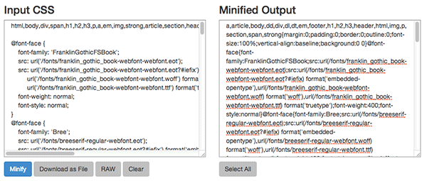
You can use command-line tools for minifying your code, or online tools like CSSMinifier.com and JSCompress.com. As shown in Figure 4-8, I pasted my site’s CSS file into the tool on CSSMinifier.com and it output minified, optimized, and shorter CSS for me to implement on my site. The output was 15% smaller than the original file.
You’ll notice that when you inspect a site’s minified CSS it can be hard to find where in the file a particular style is set, as the minified version has everything on one line. Be sure to save a copy of your original, unminified assets, as they’ll be significantly easier for you to read and edit in the future than the minified versions. On your site, use the minified versions only, so that your users will download the smallest files possible.
An additional way to compress these text files is to run them through gzip. gzip is a software application used to compress files based on an algorithm. gzip’s algorithm finds similar strings within a text file and replaces those strings to make the overall file size smaller. Browsers understand how to decode these replaced strings and will display the content correctly to the user.
To implement gzip compression, you need to enable it on your web server. How to do this depends on your server type:
- Apache: Use mod_deflate.
- NGINX: Use ngx_http_gzip_module.
- IIS: Configure HTTP compression.
gzip is great for all kinds of text files like stylesheets, HTML, JavaScript, and fonts. The only exception to this is WOFF font files, which come with built-in compression.
Caching Assets
Caching is critical for your site’s performance; assets that are cached do not need to be requested again from your server, saving a request. Caching works by sharing information with a user’s browser so it can determine whether to display the previously downloaded (cached) file from disk, or request the asset again from the server.
This information is communicated in an HTTP header, which is the core part of any request sent back and forth between a browser and your server. HTTP headers include lots of additional information like a browser’s user agent, cookie information, the type of encoding used, the language the content is in, and more. There are two kinds of caching parameters that can be included in a response header:
- Those that set the time period during which a browser can use its cached asset without checking to see if there’s a new one available from your server (
ExpiresandCache-Control: max-age) - Those that tell the browser information about the asset’s version so it can compare its cached version to the one that lives on the server (
Last-ModifiedandETag)
You should set one of Expires or Cache-Control: max-age (not both), and one of Last-Modified or ETag (not both), for all cacheable assets. Expires is more widely supported than Cache-Control: max-age. LastModified is always a date, and Etag is any value that uniquely identifies the version of the asset, such as a file version number.
All static assets (CSS files, JavaScript files, images, PDFs, fonts, etc.) should be cached.
- When using
Expires, set the expiration up to one year in the future. Don’t set it to more than one year in the future, as that would violate the RFC guidelines. - Set
Last-Modifiedto the date on which the asset was last changed.
If you happen to know when a file is going to change and you’d like to set a shorter expiration, you can do so, though a minimum of one month is still best practice. Alternatively, you could change the URL reference to the asset, which will break the cache and force the user’s browser to fetch a new version. For a guide on enabling caching with an Apache server, read the Apache Caching Guide. For a NGINX server, read NGINX Content Caching.
Between load order, minification, and caching, you have a lot of levers to play with as you optimize your site’s assets for an excellent and fast user experience. Each of these techniques becomes even more important as you implement it for mobile users who are on poorer network connections, especially if you are choosing to display different content for different types of devices or screen sizes. In the next chapter, we’ll cover how to deliberately load content for smaller screens and how to create a high-performing and positive user experience for your mobile users.